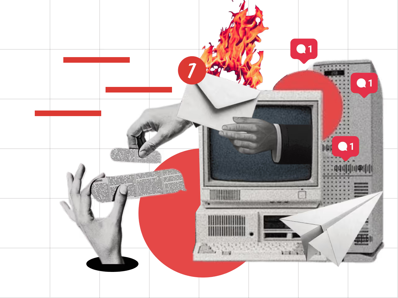
SaaS web design fundamentals need a revamp. Like hello! How long can one possibly be impressed by the generic hero banners, endless carousels, and bland color schemes?
Gone are the days when designers could simply follow a template and hope for the best. The past two years have witnessed an orbital shift in web visitor mindsets.
Attention spans are shorter than ever, and the demand for a unique browsing experience is now the norm, not the exception. So, how can you break away from the sea of sameness and create a truly engaging and innovative web experience for your users?
Let’s discover 11 modern website design trends that will help your SaaS business do just that in 2025.
1. Anti-Design and Adding a Human Touch
In 2025, web design is moving away from perfectly aligned grids and pristine symmetry and leaning toward something more human, more real.
The idea is to throw out the rulebook and show off some personality. By breaking away from the "perfect" design, you're creating something far more relatable and memorable.
Let’s cite a few examples of what this could mean for your SaaS website:
- Asymmetrical Layouts: Instead of perfectly balanced sections, you might have a hero image that's slightly off-center, creating a sense of movement and energy. It feels more like a piece of art rather than an insipid corporate site.
- Overlapping Elements: A section of your site might feature text that slightly overlaps with an image or graphic, creating a playful and layered feel. This adds depth and encourages users to explore the content.
- Bold, Unexpected Colors: Rather than the safe blues and grays that dominate most business sites, why not use bright, contrasting colors that reflect your brand’s energy? Think of a vibrant orange CTA button against a dark background or a splash of neon green to highlight important features.
2. Experimental Navigation Techniques
Navigating a website shouldn’t feel like reading a manual. As user expectations evolve, so does how we interact with web interfaces. In 2025, we’re seeing a move toward experimental navigation techniques that break away from the traditional navigation bar and dropdown menus.
This includes immersive, scroll-triggered animations that pull users through the site in an engaging and fluid way. We’re also seeing 3D transitions that provide a sense of depth, as well as hover-triggered actions that make the experience feel tactile.
Websites are now creating spatial navigation experiences, where elements of the design move or shift as the user interacts with them, guiding their journey in a way that feels intuitive and dynamic.
3. Custom Illustrations and Graphics
Stock images are on their way out, and custom illustrations are stepping in to fill the void. The trend is clear: brands want their websites to feel authentic, and nothing says “unique” like custom-designed graphics.
These could range from playful hand-drawn illustrations to sleek, vector-based art that matches your brand’s identity. Unlike stock photos, which are often overused and can feel generic, custom illustrations allow you to infuse personality into every part of your site.
These customized visuals not only help differentiate your brand from the competition but also tell a story that’s unique to you.
4. Microinteractions with Purpose
Remember when buttons just... clicked? How quaint. In 2025, microinteractions have graduated from cute gimmicks to essential UX elements. We are talking about buttons changing color when clicked, a form field gently shaking when an error occurs, or an image zooming in as the user scrolls.
With time, these micro-movements are becoming even more sophisticated, with smooth transitions that create a fluid sense of interaction. Micro-interactions aren’t just for desktop users—they’re important for mobile interactions too, as the majority of web views come from mobile devices today.
For example, consider how a mobile user would interact with a form: a button that subtly grows when tapped or a visual cue showing that a drop-down menu has been activated. These simple animations make mobile navigation feel intuitive and eliminate friction.
Also read: Mobile Interactions and Responsive Designs in Webflow
5. Parallax Scrolling
Parallax scrolling makes website backgrounds move slower than foreground content when users scroll. This creates depth and helps tell your product's story more clearly. Contemporary SaaS sites use this effect to show how features work, highlight pricing differences, or guide users through onboarding.
The key is using parallax with purpose - not just for show. Today's implementations focus on speed, using lighter code that works well on all devices.
When used right, parallax helps users understand complex ideas by showing rather than telling. It works best when showing the before-and-after effects your product delivers.
6. Scrapbook Layering
Scrapbook layering stacks UI elements at different heights, like items on a physical desk. This breaks away from rigid grids and makes interfaces more interesting. SaaS products use this style to show how different features connect and to create a clear visual ranking of information.
The look includes slight shadows, small tilts, and overlapping cards or images. This design works especially well for tools where users manage multiple projects or files at once.
Project management apps and creative platforms benefit most from this approach. Scrapbook design balances being playful yet professional - exactly what your visitors are looking for.
7. Progressive Lead Nurturing Forms
Modern forms now act more like conversations than questionnaires. These smart forms show only relevant questions based on previous answers. This makes forms feel shorter and less overwhelming, which gets more people to complete them.
Initially, only essential information is requested, and as the user engages further, the form progressively asks for more data. This not only increases form completion rates but also builds a relationship with the users.
Good designs include small animations that confirm each step, progress bars, and help text that appears only when needed. Many SaaS companies now build these forms directly into their products instead of just using them on landing pages.
This creates a smooth path from visitor to active user without the jarring switch between marketing site and actual product. It’s also an effective way to gather valuable insights while keeping users engaged.
8. Gen Z Aesthetics
Gen Z users don’t consume content the same way as previous generations. One study estimated that their attention span is just eight seconds—yes, you read that right! Mind you, this is the generation that watches countless hours of short, snappy TikToks, Instagram stories, and interactive content.
They crave immediacy, vibrancy, and authenticity in everything they engage with, and your website needs to reflect that.
Enter the Gen Z aesthetic: a bold, energetic design language that embraces neon colors, quirky typography, and abstract shapes, all wrapped in a playful package.
This aesthetic communicates individuality and creativity, two traits that are highly valued by this demographic.
For SaaS businesses targeting younger users, embracing these trends can make your site feel more relatable and engaging. Incorporating interactive elements, seamless social media integration, and visual storytelling can help foster a deeper connection.
Instead of a static, rigid design, aim for an experience that feels personalized for maximum engagement and user retention.
9. Skeuomorphism
Skeuomorphism is a design trend that mimics real-world objects in the digital space. This can include things like buttons that look like physical buttons, a notepad that resembles a real paper pad, or sliders that look like physical dials.
This works especially well when introducing complex tools or abstract concepts. The approach uses subtle textures, familiar interaction patterns, and light shadows that suggest physical properties without cluttering the screen.
New-age skeuomorphism is more subtle, often focusing on depth, shadows, and textures to make digital interactions feel more tangible and relatable. Consider using this targeted approach to make new tools feel familiar to your users right from their first interaction.
10. AI-Generated Design Elements
Generative AI is slowly making its way to the forefront of web design. AI tools are now capable of creating custom graphics based on user data and design systems, opening up a new realm of personalized user experiences.
Instead of offering the same content to every user, websites can now feature relevant content tailored to individual preferences.
This means the design you see could change depending on who you are, what you like, or how you interact with the site. It's a huge step forward in delivering a truly personalized, relevant experience for every visitor.
While AI can’t replace human creativity, especially when it comes to ideation and optimizing conversions, it can significantly reduce design timelines and lower costs.
Automating certain design elements like layouts, banners, and icons allows designers to focus more on strategy and creativity.
However, for more nuanced and mission-critical tasks crafting a brand identity or ensuring optimal user flow, you need to reach out to human experts like Beetle Beetle.
11. Brand Worldbuilding
Since we are on the topic of carving out a unique brand identity, let’s talk about brand worldbuilding and what it means in web design terms.
According to this particular design principle, the website becomes a visual representation of the entire brand universe. This goes beyond the logo and color palette to create an immersive environment that tells a story and invites users into the brand's world.
Think of it as creating a distinctive narrative or atmosphere around your product or service. This can include custom illustrations, animations, and storytelling elements that reflect your brand’s values, personality, and mission.
Modern web design is difficult to master without a clear strategy. Slapping a bunch of cool effects without direction or purpose goes against the very principles of modern web design.
Unless you have the time and effort to invest in a thoughtful, user-centered approach, do what your fiercest competitor could do before they do it. Hire Beetle Beetle.
Design a Website That Matches 2025 Aesthetic With Beetle Beetle
"Modern" is an ambiguous term, as most of you have already realized. Most of the trends you see today have existed since time immemorial. Some of them are completely new, while some have been around for years but with slight tweaks.
If you are not sure which elements to pick or how to optimize them for better lead generation, retention, or conversion, reach out to Beetle Beetle. Our SaaS experts are familiar with all the latest trends. Plus, they have the skills and resources to implement them effectively.
We are a certified Webflow partner, which means your website will perform seamlessly across all devices. Our in-house designers can custom illustrate elements to match your brand’s unique identity.
Ready to reinvent the wheel of SaaS web design? Hire Beetle Beetle for web design today.


